WOO! I can't believe it - my first blog post on a personal project that's been brewing in my heart and mind for a few years. I officially started it a year ago and today's post is on my very first Street. But before I get ahead of myself, here's a bit about what the project is, how it got started and what I hope to gain from it.
This is a temporary placeholder for a logo. I'm looking forward to using some of the design elements I photograph in Charlotte as part of the branding. Stay tuned!
What is Every Street CLT?
Every Street CLT is a personal project of mine in which I plan on walking or biking up and down every street in Charlotte and sketching // taking photos along the way. So, yeah - I'm in it for the long haul.
What started it all.
When I first came to Charlotte, I moved to NoDa, and still live there now. My husband and I have worked in South End and now work Uptown. We shop at Trader Joe's in Midtown and like to explore Elizabeth // Plaza Midwood. And that is the extent of our Charlotte bubble. We RARELY venture out of it.
Although, it's a GREAT bubble, it's a bubble nonetheless. After attending events like WeLoveCLT, Charlotte Living Room, Charlotte Agenda Talks [those are gone right?], Civic by Design Forums and other community building // engaging events, I realized there was SO much to this city that I just knew nothing about.
I kept listening to people talk about their love for Charlotte and ways we could improve it and so many of them said things like, "Start on your street," and "Start small." And though, I still don't entirely know what my role is in this city - I know that I love it and I want to get behind people and causes I believe in to help make the Queen City even better than it already is!
I feel that, by walking or biking down every street in the city, I'll form a deeper relationship with Charlotte. I'll go in neighborhoods I've never been in, meet people I've never met, find new businesses to support, and possibly come up with some solutions or at least gain more insight into how some of our city's problems can be resolved.
That's the more altruistic reason behind the project, but let's get real - there's something in it for just me too.
I absolutely LOVE to travel - but I don't get to do it as often as I would like because my husband and I are working hard to pay off our debt and live debt free. You can read more about that here and here. So, for the last four years, I've been experiencing ITCHY cabin fever. I just want to get OUT. I want NEW experiences. I want to find cool places and see beautiful things.
I also want to sketch and photograph again. I was fortunate to study abroad while studying architecture in college for a semester and all we did was walk around Europe all day long touring the most beautiful buildings and sketching // taking photos. That's it. It was AMAZING and I MISS it. Those were some of the best days of my life. The pace and the depth of conversation and study was incredible and I am craving that again.
This project is a budget friendly way for me to recreate some of those feelings and experiences.
Another thing - if you're not "from" Charlotte then you don't know about the utter outrage over all of the apartment buildings going up. People are moving here in hoards and buildings can't go up fast enough [I know because, cough cough, day job.] I also know that developers, owners and architects could be doing a much better job of listening to the community and providing better designs and better community engagement. There are a few doing better than others, but I think all can improve.
That being said, buildings are being torn down in order to make room for said apartments. Buildings with history and character and detail and that warm, textural coziness that just makes you want to be THERE. In that spot. In that place.
As an architect, it breaks my heart that this is happening in the industry. So, I honestly want to do my best to capture some design elements of the city before they're all replaced with Hardie board panels. I digress...
Ok. Those are the reasons, now on to the first Street. I joined the planning // social media team for CreativeMornings CLT back in October 2015 and our first event was held at Laca Projects. It was the first time I'd really been over there, besides just driving through, and I knew I wanted to start in that area.
Sidenote: I haven't been able to identify what neighborhood Laca Projects is in. Every map I look at is blank in that spot...
Neighborhoods according to House Charlotte
I chose W Moorehead between 277 and Freedom Drive in the Wesley Heights // [Blank] neighborhood and took my husband along. It was great. See some of my favorite details below...
My husband Carl. Love him SO much.


The photos above are from a little strip of buildings together. I love a good round brick wall, the large plate glass windows, the green tiles and the use of different brick. Each tenant portion of the building looks a little different from the other [something that's lacking in most design today IMO] and the use of color with that awesome typeface is just. cool.
I gather there used to be a coffee shop and a tattoo parlor here [from the sign] and it's currently vacant with signs to lease or sell. The facades are just SO cool - I really hope someone comes along and renovates this gem.
What we can learn from this building
Different shades of brick and stack patterns can be used to separate tenant spaces.
A curved brick wall can add interest to an otherwise monotonous facade.
You can break up a facade by adding different roofing elements like green tiles and brackets.
Unexpected colors and typefaces add character and depth to a space.


You may recognize that first photo - I've posted it a few times as well as used it in my 2016 In Review graphic. Sadly, this building is gone and will soon be replaced with an office building [I believe] - correct me if I'm wrong. As soon as I saw this building I fell in love. Sure, it needed some TLC, but it was great.
First of all, I'm a sucker for a white building - especially one with brick. Secondly, the ornamentation panels are my very favorite that I've seen ANYWHERE. Maybe that seems a bit extreme for you, but I LOVE them - I think I need to get the photo blown up and framed for my house, because I love the organic, delicate detailing.
Another thing I've noticed on the old buildings is the numbers. Most are very simple, but nowadays many places are using stickers instead of picking out their three-dimensional, opportunity for design and texture, physical address numbers. It's a small detail, but after designing and constructing a building it's the last 10% like address numbers, placards, way finding signs, etc. that makes a big difference. With such a small barrier to entry, I'm surprised more people // companies don't extend their focus or budget for the final small details.
What we can learn from this building
Painting a building white, especially brick, offers a fresh, clean, modern update to an old building and creates visual margin amongst other beige // red or brown brick buildings.
Adding delicate ornamentation panels adds depth and texture while making the building stand out amongst other flat facades.
Paying attention to address numbers, placards, way finding signs, etc. is the last 10% of the project and is like icing on the cake. They give the building a finished and complete look.
The two images above are from, you may have guessed, what used to be a Coca Cola building. What grabbed my attention, besides the fact that the sconces are just awesome, is that they match the cast in place detailing above the door.
See it? The upwards pointing arrow shape? It's a part of the buildings design AND it's picked up in the lighting fixtures. Kudos to the designer - very Frank Lloyd Wright of them. This is an example of the last 10% being designed and chosen in order to complete the building. Bravo.


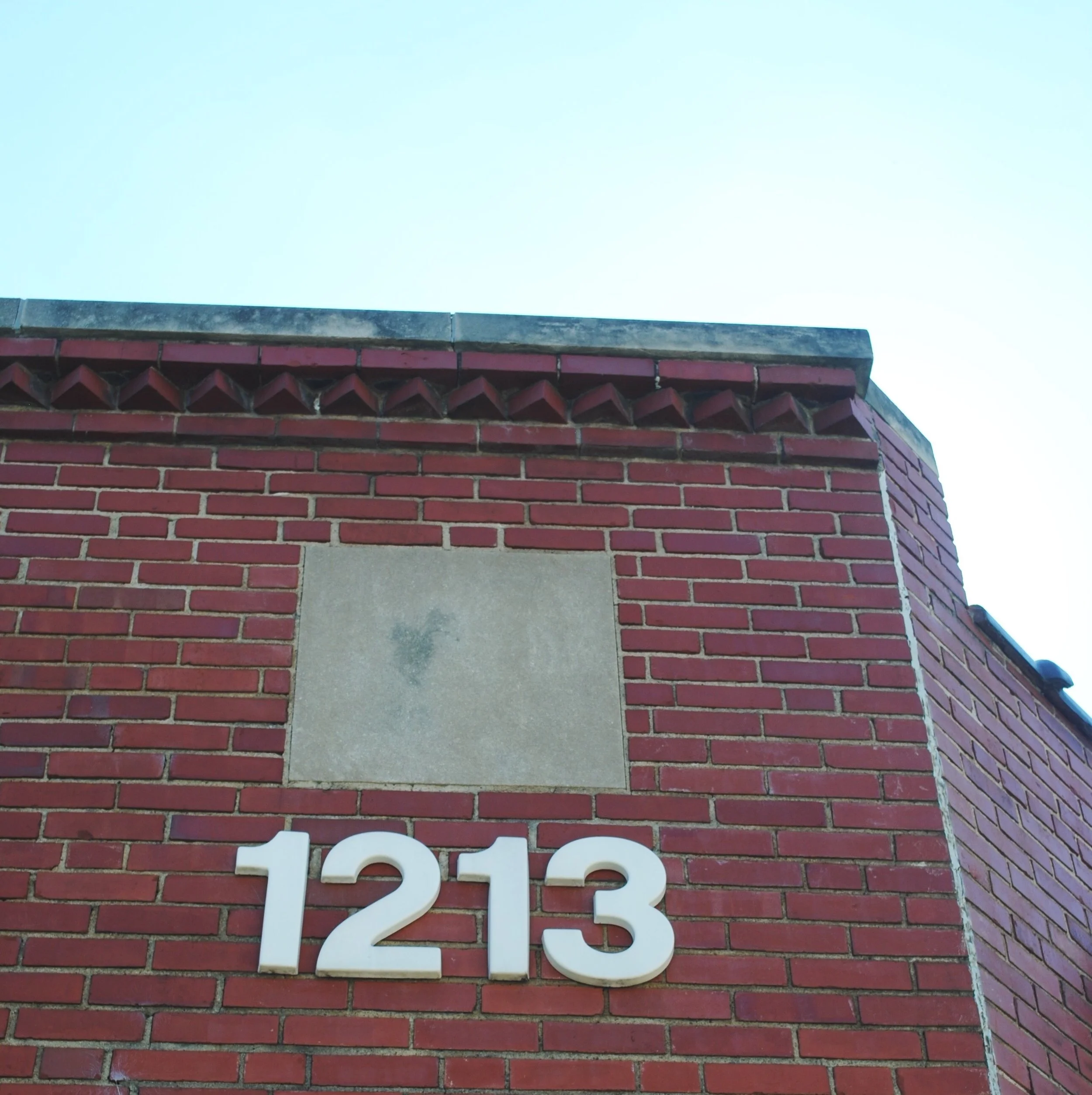


The last images are from various buildings of design elements I found interesting that you just don't see in current construction or design. I miss the hand painted signs, the physical address numbers, the formwork and the detailing.
Maybe it's unreasonable of me to desire or expect for architecture to revert back to custom, individualized designed buildings when technology provides the ability to reproduce the same thing easily and cost effectively over and over again causing buildings to go up quicker and quicker causing owners and developers to make higher and higher profits. But, I just don't agree.
I believe, even if people aren't aware of what they're missing, that they'd appreciate a building that was designed and thought through carefully from design to construction. I believe there's a way for both and I hope to see more of it.
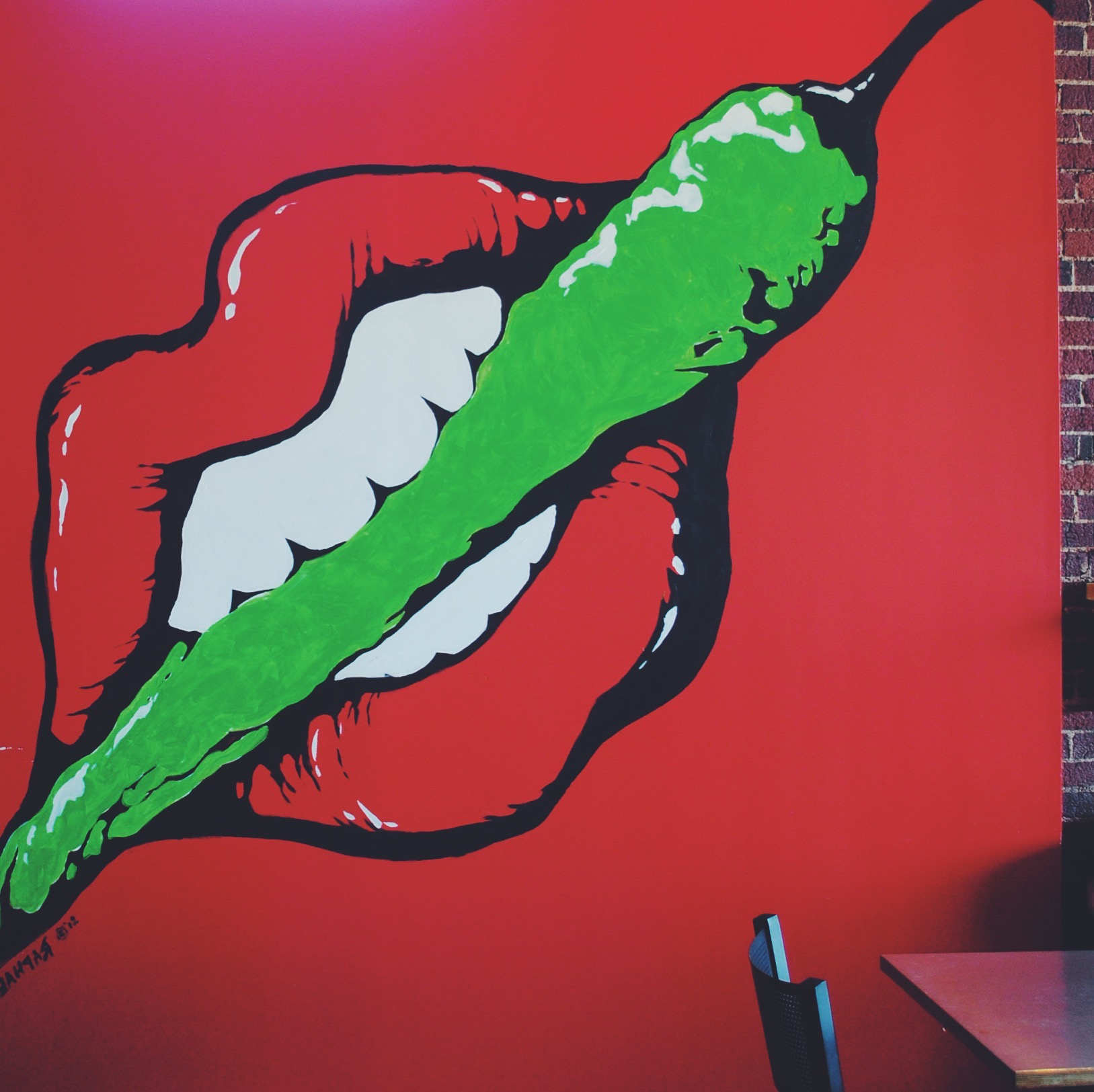
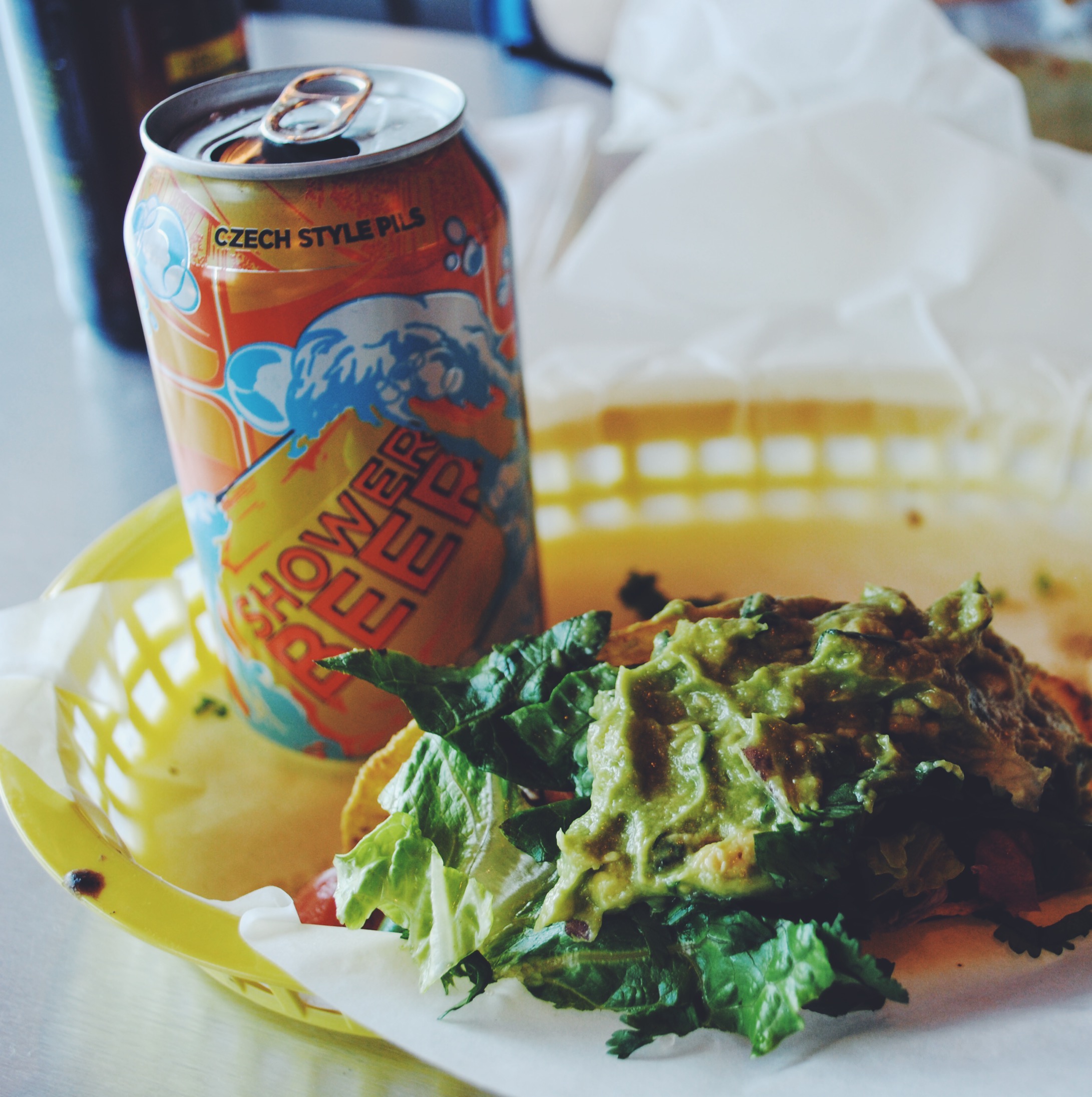
After walking up and down both sides of the street, we popped in to Picante for some delicious $2 tacos and a cold beer. They were really good and just what we needed. While we were there, one of our friends came in and we got to chat for a bit - an unexpected surprise. That's what I'm really looking forward to, the unexpected surprises and the people we see and meet along the way!
Once we got in the car, we drove around the neighborhood and popped over to Frazier Park - which SO FAR - I think is the most beautiful park in Charlotte. No pictures, but the neighborhood and the park were so cute - we even talked about maybe living in that area one day, if NoDa doesn't work out for whatever reason.
Until my next Every Street CLT adventure...
Love & Blessings,
Genevieve
P.S. Have you visited my Start Here page yet? Now's your chance!
P.P.S. Curious to know more about my Design Services? Check them out!
P.P.P.S Check out this fun Charlotte neighborhood quiz on Charlotte Agenda.
